pROSPERA iSA
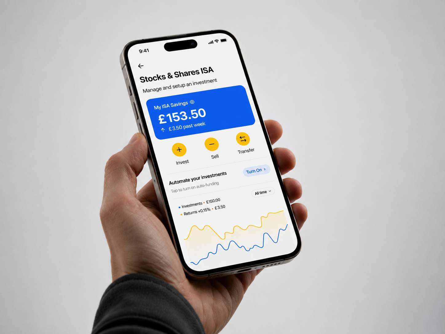
Inspiring the younger generation to invest in ISA with confidence
my Role
This was an academic project and I worked as a sole UX designer; the UI & UX, content, illustration and full product development.
TEAM
Team of just one (me), as being an academic project.
YEAR
2025
TOOLS
Figma, Whimsical
overview
Prospera was designed to create a personalised experience for customers to grow their money online and to help Lefta Wealth modernise and surface its digital presence
scope
UI/UX, Web Design, Interactive Prototyping, User Research, Visual Design, Design Thinking
pRODUCT OUTCOME
In a class of 35+ students, I got to present my design case study to the Barclays Glasgow, UK design and development team with 3 others, where I emerged first place. View slides here
HOW DO WE INSPIRE THE YOUNGER GENERATION TO INVEST IN THEIR FUTURE?
Our client Lefta Wealth is a wealth management bank with a strong traditional heritage, servicing customers globally for over 100 years offline. A well-respected bank offering a large range of services to their customers within investments and helping them grow their wealth.
Now they are looking to transition and surface digitally, creating an online presence by launching a new stocks & shares ISA product online that would attract a younger demography of users (18-30 year olds) while still retaining their older and loyal customers (40-60 year olds) and aligns with both target audiences.
"How might we design a digital product that increases trust and confidence and create long term engagement for both demography of users?"
What did we discover?
Using the double diamond process, we were able to guide the project towards understanding this demography of users and find an answer to these problems we are trying to solve. We categorised these insights from research into three themes; Finance & Savings, Knowledge & Literacy, and Socialising & Gamification
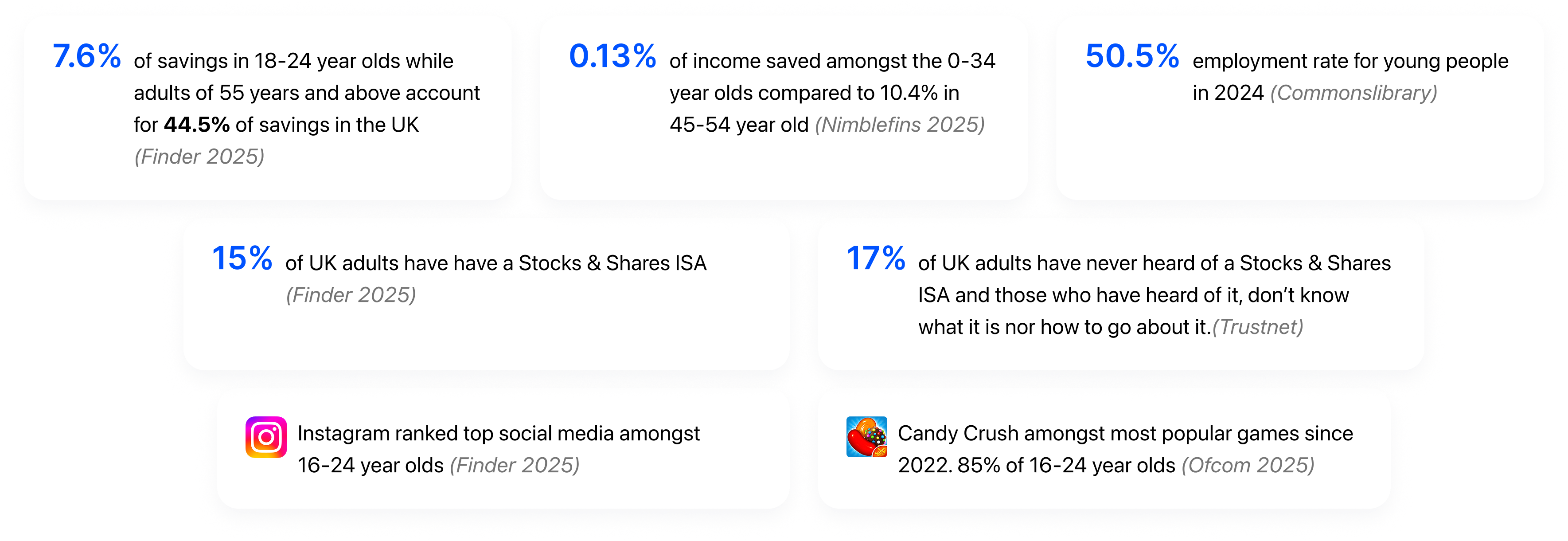
understanding the users...
A current look in the markets to competitors like Wealthify, Moneybox and Plum from a user point-of-view helped us understand why these current products fail to meet user needs, leading to frustration, churn and lost revenue.
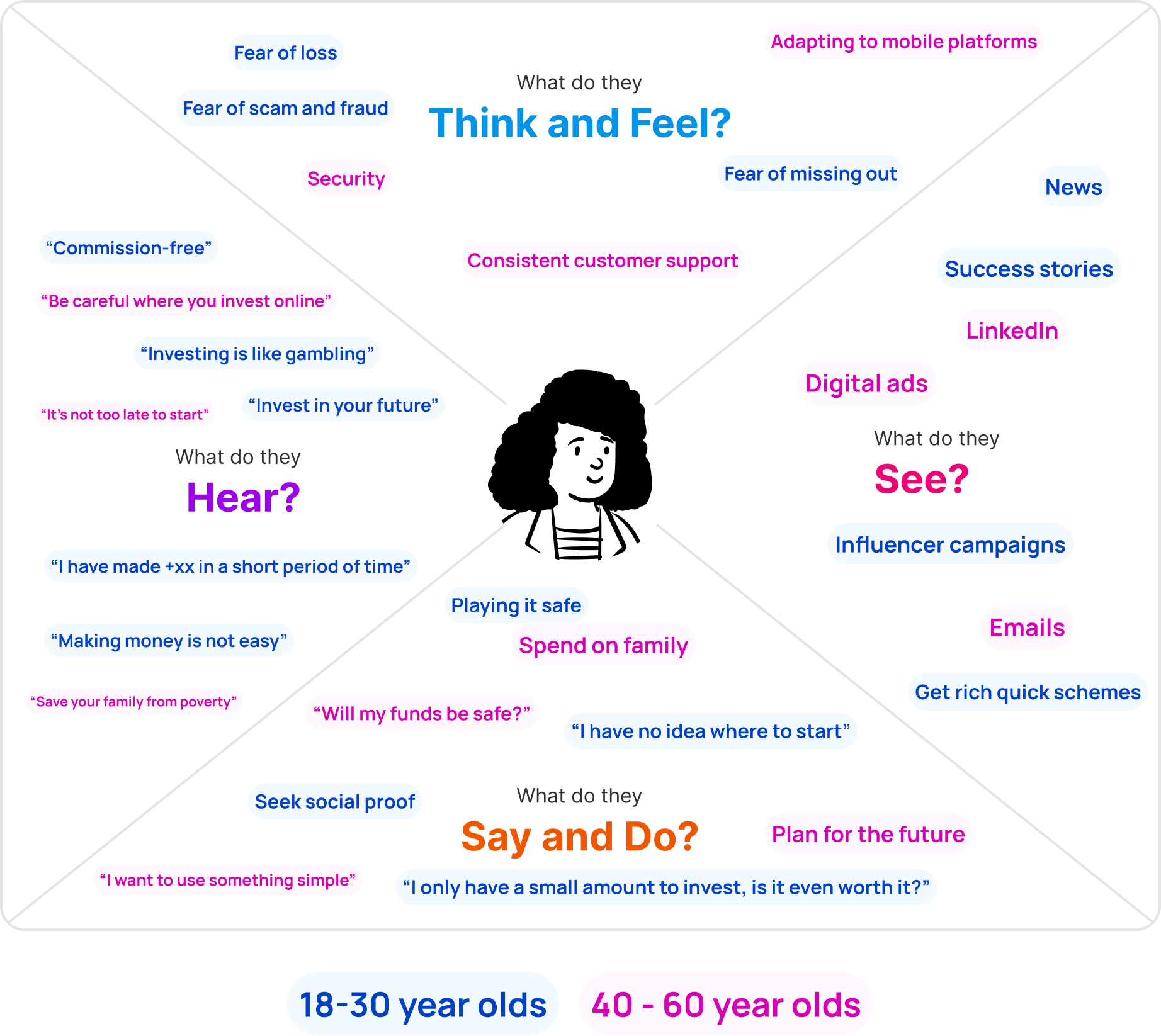
To understand the confidence gap, we went through empathy mapping to understand fear, behaviour and motivations. During the data-gathering process, we synthesised insights through affinity mapping, a consistent pattern recognised as an opportunity was to build this product as a financial mentor, offering a clear path to greater knowledge and control, guiding users and building confidence.
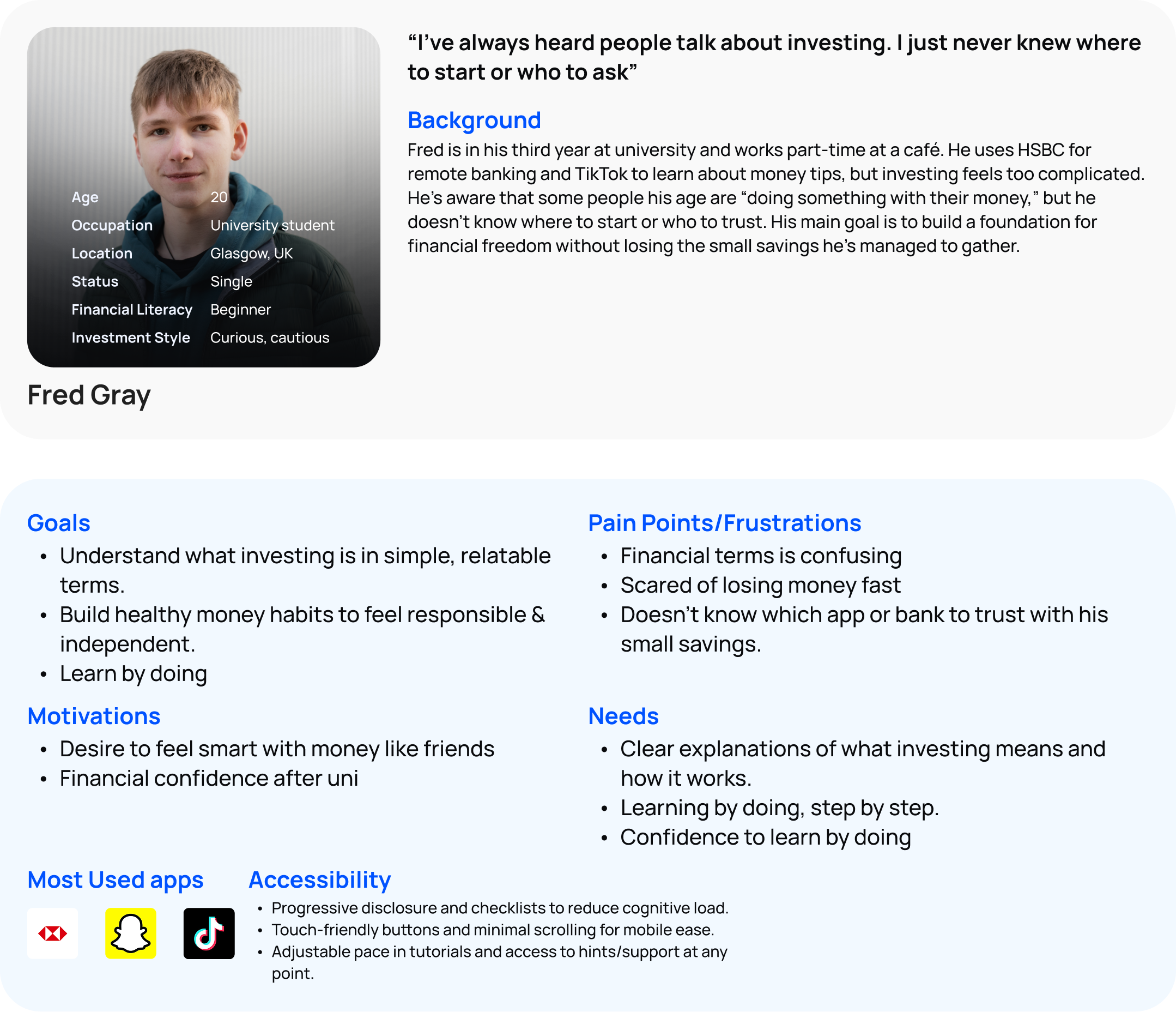
We then explored both user archetypes to create two distinct persona we aim to serve looking to their needs, goals, pains and frustration, as well as featuring what accessibility looks like for the younger generation new to investing and financial literacy, and the older generation new to digital experiences.
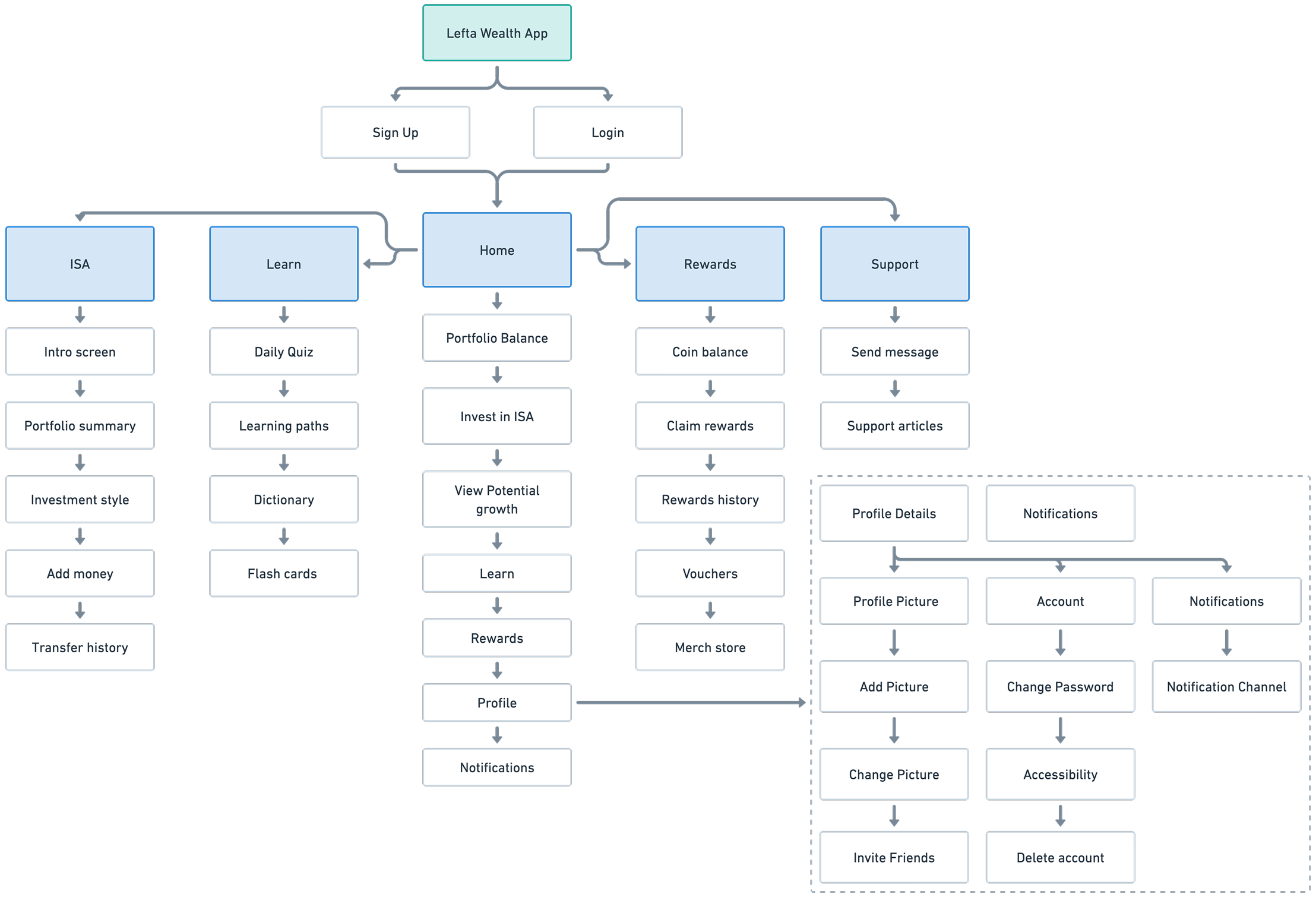
Mapping out flows and features
The main point of the flow is to ensure that the functionality is always visible to the user, but not in an obstructive way. So we use the bottom navigation to display userflows where it’s only a tap away but still not intrusive. While this is a niche product app, the information broadens from investments alone to learning and also earning on simple actions like creating your first investment or taking a quiz.
EARLY IDEATION TESTING...
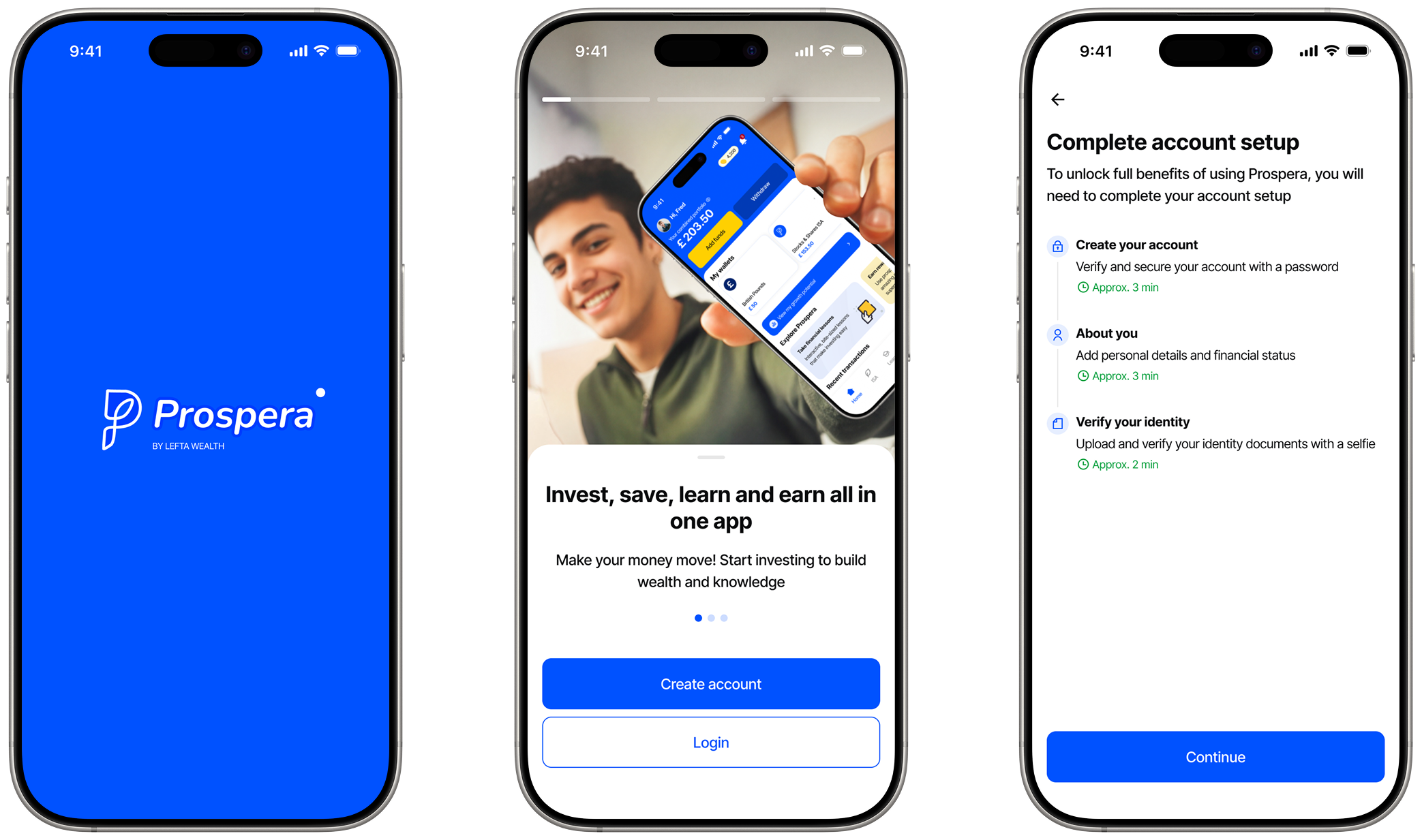
This helped with sketching and initial ideas of userflows, where we then ran an unmoderated test on 2 participants on the low fidelity iterations and realized our initial onboarding was too long, so we shifted to progressive disclosure to reduce the cognitive load and also how unclear the ISA flow was, leading to adding an introductory screen explaining what ISA is all about
.png)
The key insight was drawn from research and data which was simple but powerful. People don’t fail at investing because they lack tools. They fail because they lack confidence.That insight became the foundation for every design decision because users are willing to learn, just not to risk blindly
"People don’t fail at investing because they lack tools, they fail because they lack confidence."
ONBOARDING
It is said that an effective, well-designed onboarding can increase user retention by up to 50% so we give an overview of the products’ USPs from the jump.
dESIGNING FOR TRUST
Considering this product as a financial product and the problem we are trying to solve, trust was designed into the experience, not added as an afterthought. Clear language, transparent risk communication, and visible security cues help users feel safe at every step.
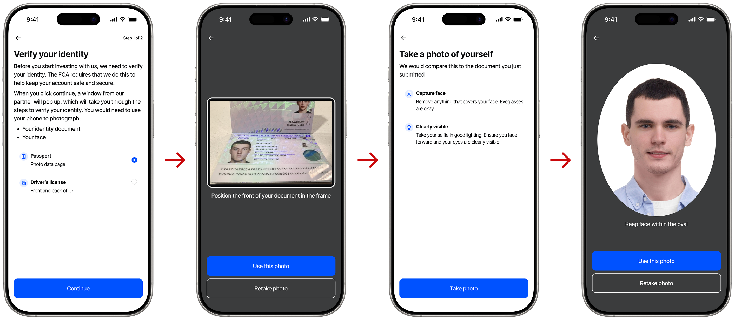
Guided experiences for users
Our target demography are mostly beginners, and are not left alone to figure things out. We use nudges and progressive steps to offer some hand-holding and reduce cognitive load without removing control, making one step after another towards their goal
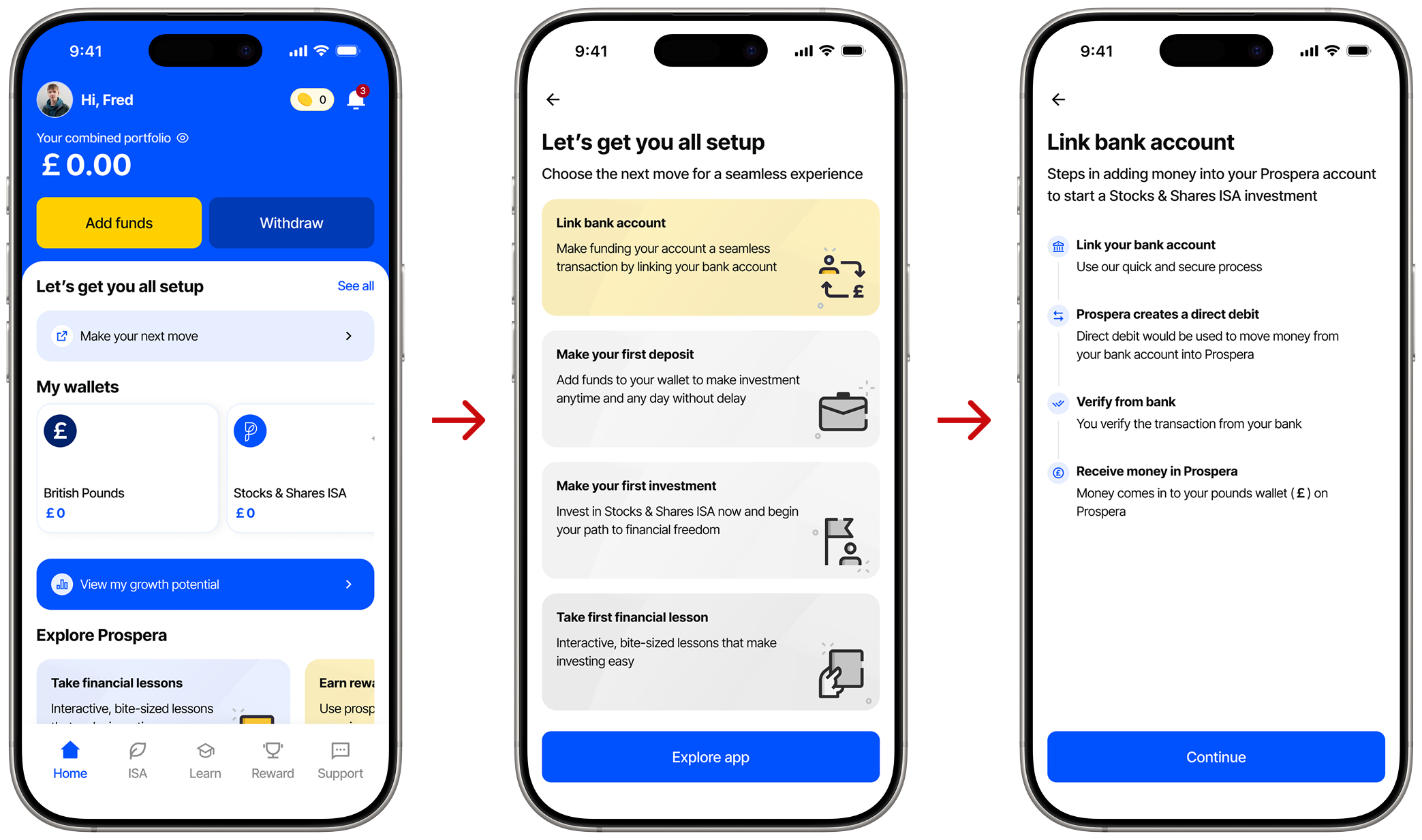
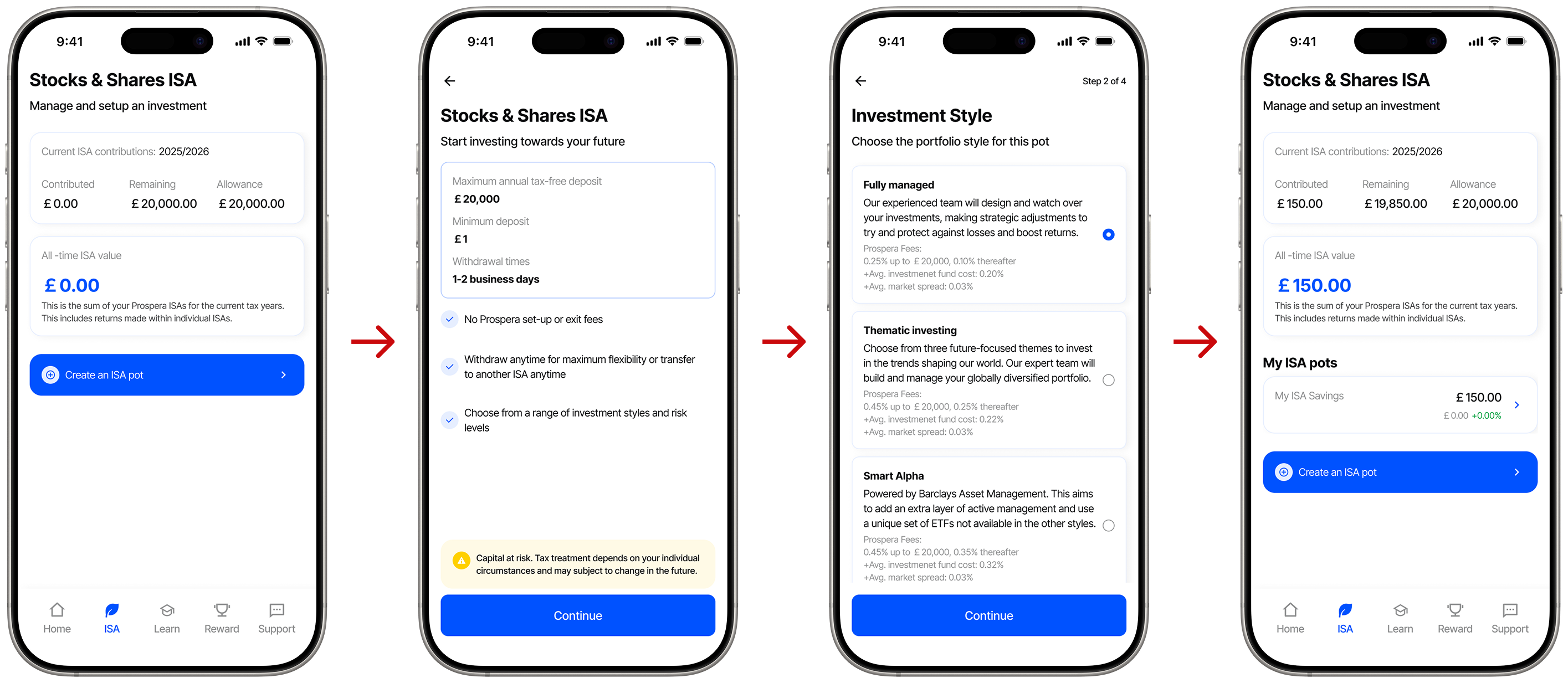
make the most out of investing
We personalised investment experience as they create a Stocks & Shares ISA, creating multiple ISA in pots, as a form of investment goals-setting up investment themes and risks levels
BITE-SIZED LESSONS
We introduced learning pathways to grow financial confidence and gamified the learning experiences for users to reinforce learning for more engagements and user retention.

Quiz and lessons
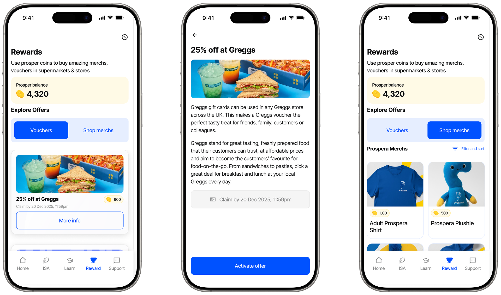
Users learn and earn with the gamification, we use "Prosper coins" as away of rewarding knowledge, and overtime they earn as much Prosper which they can use to reward themselves.
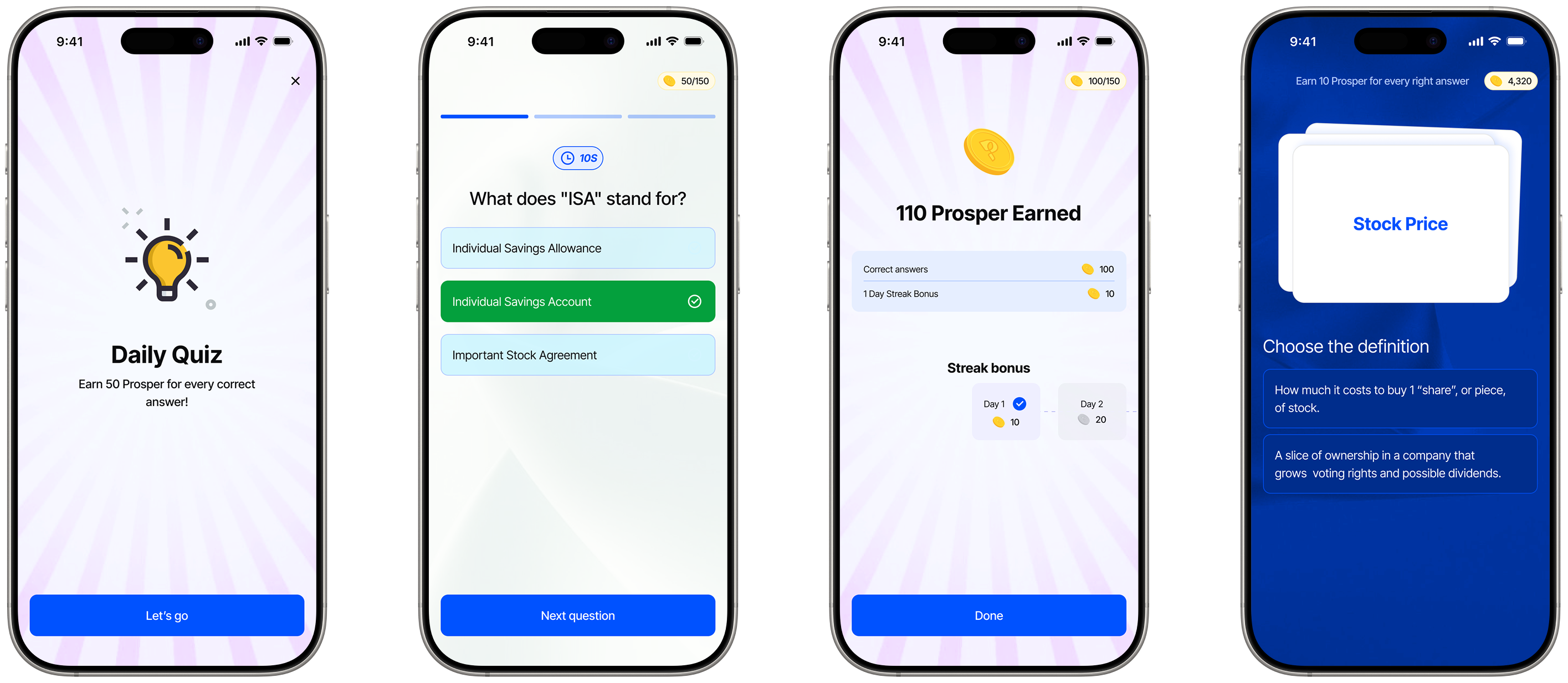
Rewarding with delight
These rewards, prosper coins can be spent as vouchers in stores and also traded for customised merchandise. This is a great method to reward users for their engagement and also build active users and retention on the product.
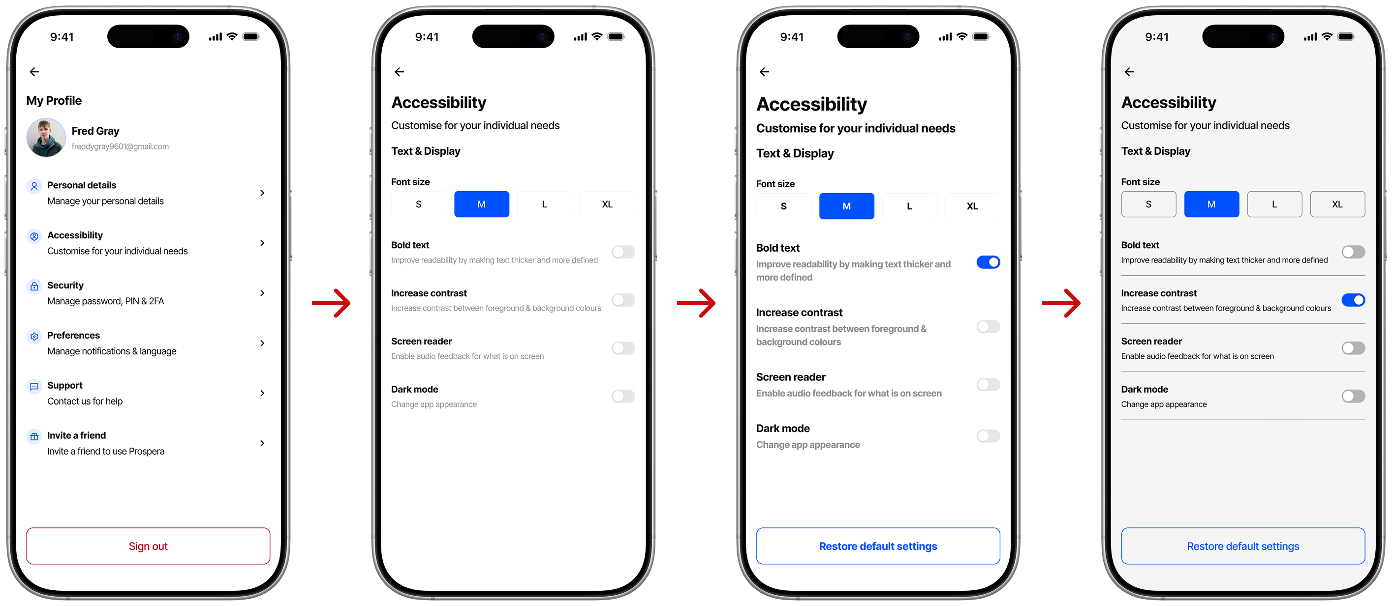
ACCESSIBILITY & INCLUSION
Accessibility choices benefit everyone. We highlighted a few accessibility customisation for individual needswhile ensuring that all UI elements met the WCAG 2.2 AA standards before mapping out prototypes.
Reflections...
A challenge was learning how much usability testing cannot always be in a perfect environment, trade-offs need to happen and feedback needs to be received and made in good use. It was interesting to learn around how using modern trends and research insights can help angle product design and improve experiences.
Prospera shows how a traditional wealth institution can evolve digitally without losing its core values. By designing for confidence, we don’t just help users invest, we help them stay and reap benefits along side their investments.